PRACTICAL INTERIOR DESIGN
HOUZZ contributor, Denise O’ Connor, explored the importance of practicality in interior design, exemplifying the crucial roles that lighting, storage, and layout play in a comfortable living experience. By allowing our own experiences in the field to lead the way, we thought it would be fun to highlight five of our favorite practices mentioned in O’Connor’s “10 Keys to a Well-Functioning House.” Considering that the first step in any great interior design is practical visual concepts, we know exactly where to begin. When it comes to getting started, layout is everything.
#1. Layout is Everything
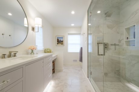
Layout is not just the foundation for an aesthetically pleasing experience. The layout also plays a significant role in a home’s functionality. When we first stepped foot into this Westchester NY bathroom, we knew we were witnessing the wake of a dysfunctional layout. Originally, a monstrous tub sat at the far end of this space, while the toilet started back at visitors from the center of the long wall. These atrocities were accompanied by an undersized shower and two sinks crammed together that offered a claustrophobic vanity experience. Not only was the bathroom unpleasant to look at, but it was nearly impossible to use.
After ditching the clunky tub, the next step was to move the toilet from view. A knee wall was erected for privacy, without blocking light from the window. With the toilet relocated, it is tucked away from the entrance’s view. We took the existing two vanity sinks and replaced them with one center sink, two generous sets of drawers, and a smaller make-up area. With most of the essentials laid out with space to spare, we were able to upsize the shower to a walk-in steam shower. We maintained the client’s desire for long-term durability by using a mix of porcelain tile and quartz, a cost-effective alternative that offers both high-end aesthetics and practicality.
#2. Think Ahead
In life, it’s always wise to think with the future in mind. So, why would it be any different for interior design? Just last year in 2021, one of our clients thought ahead, leaving a space in their bedroom open for future additions. When embarking on a new construction project, it’s easy to get caught up in filling space with features that meet your immediate needs. However, immediate needs change, and sometimes sooner than you expect.
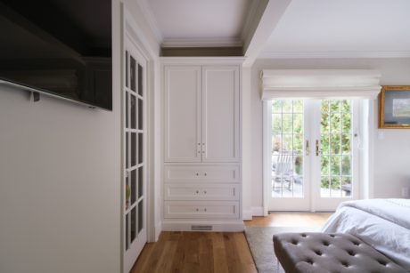
This client needed supplemental closet storage but was challenged with an awkward space. Instead of rushing to buy a piece of furniture that would never quote function optimally, the client thought ahead and left an open space for built-in custom cabinetry. The sloped ceiling and dropped structural header were accommodated by our JWH custom cabinet, without losing critical storage capacity. Oh, but what about the existing HVAC etched in the hardwood? Nothing that a slotted baseboard can’t handle! At the end of the day, if the client had not taken the time to think ahead, a short-term solution might have been a long-term mistake.
#3. Layers of Color
When most of us think of color, we strictly think in terms of visual appeal. Although the latter is correct, color does much more than just look good to our eyes. Color dictates how we feel in the space. If the colors are off then the room’s energy will be off, too. With color, it’s not just about what we see… it’s also about how we feel.
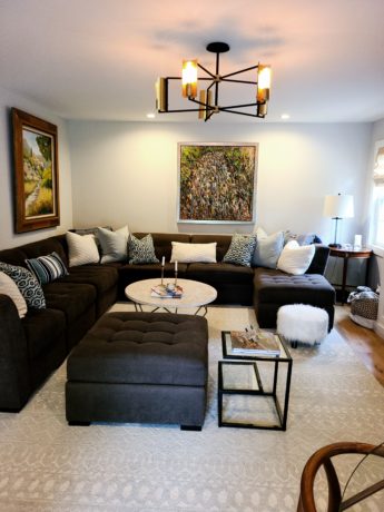
When considering a room’s color theme, start neutral. This means to take a neutral color—white, beige, gray, and a touch of black—and build from that color utilizing contrast to your advantage. Our living space above is a perfect example of using colors to create the room’s feel—its energy. We started with Benjamin Moore’s “Whisper” as our neutral color on the walls and cabinets. We incorporated the client’s two vibrant paintings with contrasting features—the wooded frame on the left is a Mocci and the piece directly in the center is by Samir Sammoun. On the floor is a neutral Ralph Lauren rug, with generous sectional in a medium gray. As we can see in this room, effectively layering the colors in the interior design gives the space soul.
#4. Finish with a Bang
Finding the appropriate finish materials for your home will be greatly influenced by many variables. Your personal preferences and the geographical location of your home will play a role. Are there a lot of existing windows in the room? How is the room’s ventilation? The list goes on and on. Finding the right finish for your home is essential to achieving a practical living experience.
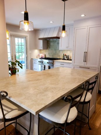
Our client wanted countertops that appeared soft to the eye, yet they needed a stone hard enough to withstand any culinary endeavor. To satisfy both worlds, we featured Walker Zanger’s Leathered Mother of Pearl quartzite. For the walls, Benjamin Moore’s “Whisper” was used with an eggshell sheen to make for easy cleaning and longstanding livability. All appliances by Thermador give our clients quality equipment with a sleek appearance. Emtek Hardware offers a great satin brass finish to complement the lighting by Hudson Valley and Visual Comfort. Layering the mixed metals, stone and tile textures and various light sources can be a challenge to mix and match, but when it’s all said and done, it is worth the effort!
#5. It’s no Home without You!
Your home isn’t your home… well… without you! Consider your needs, your hobbies, and your visual preferences before you start the interior design process in your home. Make sure that the space is used in the way most practical for your lifestyle. Choose practical features for your interests and passions, and make sure to surround yourself in colors that are specific to your happy place.
Our client was willing to give up their formal living room for an upgraded dining room. After much thought, they realized that they wanted a space that better correlated to daily living and hosting guests. They wanted a space that was practical enough for practical tasks like answering emails, wrapping gifts, or opening Amazon boxes. Nonetheless, they wanted that same space to be graceful enough to celebrate special occasions with family and friends. In turn, we gave them a welcoming spread to meet their needs: a table for tasks and dinners, a fireplace for special occasions, a room bright enough to do paperwork yet serene enough to relax with a cup of tea.
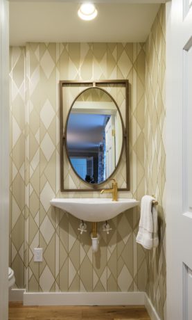
Furthermore, the far end of the room included a small powder room. Inhabited by an awkward corner sink, the walls were blanketed with stone tile. Simplifying the powder room space with a Toto floating sink and a classic wallpaper, created a space that guests would be happy to visit. This project, no doubt, was unique to this client. At JWH Designs, that’s how every project should be. The very first step to any dream home, however, is you.
